Write the Money Flow on a Napkin: How to Run a Cause Campaign That Actually Moves Money
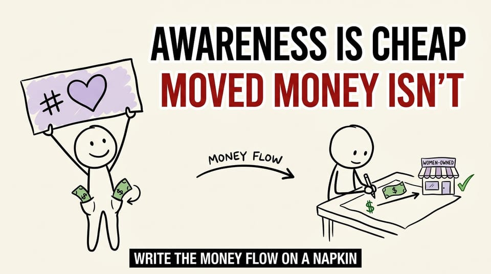
Table of contents
Most "awareness" campaigns are a pink banner and a hashtag.
You have seen them. A brand swaps its logo for a themed version. Posts a heartfelt quote. Maybe runs a sale that was already on the calendar. The cause gets a mention, the moodboard gets a workout, and when the month is over you would be hard pressed to point at a single dollar that landed differently because the campaign existed.
Earlier this year, one of our clients ran a Women's History Month promo. And the first version of the plan was heading straight for that pink-banner place.
This is the story of how we pulled it back, and the simple test I now run on any campaign that claims to support a group of people. I call it the napkin test, and it has saved more campaigns from politely failing than any clever headline ever has.
The first draft is almost always a poster
The client sells haircare. Good brand, real audience, a founder who genuinely cares about the women she serves. None of what follows is a knock on her. She is exactly the kind of person these campaigns are supposed to be easy for.
The first cut of the March plan looked the way most of these look. A celebratory hero image on the website. Purple, to nod at the season. A headline about empowerment. A hashtag to tie it together.
It would have looked great. It would have moved nothing.
Not because anyone was lazy or cynical. Because we were designing a poster, and a poster is a picture of a thing, not the thing itself. A poster of a meal does not feed anyone. A poster of support does not support anyone.
The trap is that posters are satisfying to make. You get a hero image, a color, a tagline, and a feeling of progress. You can show it to people and they nod. It photographs well. And none of that satisfaction is correlated with whether the campaign does anything in the real world.
So we stopped designing the picture and started designing the mechanics.
Treat the promo like a product, not a poster
Here is the mental shift that changed the whole project: a campaign is not a graphic. It is a small product. It has users, a job to do, and ways it can break. If you have ever shipped software, you already know how to build one. You just have to point that discipline at marketing.
When my delivery team builds a feature, we do not start with the screenshot. We start with what it has to do, who it is for, what the success condition is, and how it can fail. We pointed that exact lens at the promo.
The mechanic we landed on was deliberately simple:
- Forty winners. Not one.
- Twenty-five dollars each. A real, specific amount.
- Earmarked for women-owned brands stocked in Macy's and CVS, so the prize money flowed toward the people the campaign claimed to celebrate.
- Enter by following the brand on TikTok. One clear action, no purchase required.
- Published dates. A clear start, a clear end, and a clear day the winners would be announced.
Read that back. There is a real dollar in it. Forty of them, actually, each one pointed at a woman-owned brand. The "celebrating women" part stopped being a sentiment on a banner and became a line item with a number next to it.
That is the entire difference between the two versions of this campaign. The poster version stops at the feeling. The product version has a money flow you can trace.
The boring questions were the campaign
Once we had a mechanic, the real work started, and it did not look like marketing. It looked like a list of unglamorous questions in an email thread. That thread is where the campaign actually got built.
Do people have to buy something to enter, or is following enough? We chose following. A purchase requirement raises the barrier, shrinks participation, and quietly turns a celebration into a sales gate. Following is low-friction and honest. More entries, cleaner story.
When exactly does the promo end? When do winners hear back? We picked the dates, published them up front, and stopped making people guess. Ambiguity is where trust leaks out of a giveaway. "We'll announce winners soon" is how you turn excited entrants into suspicious ones.
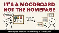
How do we stay celebratory without creating confusion? The design supports the message instead of shouting over it. The purple nods at the season. The copy points at the action. Nothing competes for attention with the one thing we needed people to do.
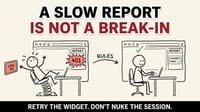
None of those questions are exciting. All of them are the campaign. The moodboard was the easy twenty percent. The edge cases were the eighty percent that decided whether anyone actually participated and whether the money actually moved.
This is the part most teams skip. They fall in love with the hero image and treat the rules as paperwork to be cleaned up later. But the rules are not paperwork. In a promo, the rules are the product. They are the part the customer actually touches.
If you have read my piece on why moving a deadline can be the bravest thing a team does, this will sound familiar. The pattern is the same: the boring, specific, slightly uncomfortable operational work is almost always where the real outcome lives. The flashy part is rarely the part that matters.
Why small and structured beats big and splashy
There is a quiet lesson hiding in the choice of "forty winners at twenty-five dollars" instead of "one winner at a thousand."
A thousand-dollar grand prize photographs beautifully. It also concentrates all the benefit on a single person and makes the odds feel hopeless for everyone else. People do the math instinctively. One winner out of thousands of entrants reads as a lottery, and most people do not emotionally invest in lotteries.
Forty small, clear prizes do three things a single big prize cannot:
- They spread the benefit. Forty people win instead of one. Forty different stories get told.
- They lower the perceived barrier. "I have a real shot at twenty-five dollars" beats "I will probably not win a thousand."
- They distribute the money toward the cause. Forty dollars pointed at forty women-owned brands moves more total money to the target than a single grand prize ever would, and it does it visibly.
In a tighter economy, this structure matters more, not less. People have gotten allergic to splash. A giant prize reads as marketing theater. A clear, achievable, obviously real reward reads as a brand that actually thought about the person on the other end.
The general rule: many small dollars, clearly placed, will usually out-earn one big dollar designed for the highlight reel. Splash buys attention. Structure buys trust. Only one of those compounds.
The napkin test
Here is the test I run now, before any campaign that claims to support a group of people. It takes about ninety seconds and it has killed more bad ideas than any strategy deck.
Write the money flow on a napkin.
On one side, write the campaign. On the other side, write the people you say you are celebrating. Now draw the line between them, and label every hop the money actually takes.
If you can draw a clean line, a real dollar that lands with a real person because of something you specifically did, you have a campaign.
If the line is fuzzy, if it routes through "brand awareness" and "engagement" and "impressions" and never quite reaches an actual human, you do not have a campaign. You have a moodboard with good intentions.
That is not a knock on caring. The founder cared. Most people running these campaigns care. Caring is the starting condition. It is just not the deliverable.
The deliverable is moved money.
When you run the napkin test honestly, one of three things happens:
- The line is clean. Ship it. You already did the hard part.
- The line is fuzzy but fixable. This is the common case. You discover the campaign is mostly vibes, and you go add a real mechanic, the way we did.
- There is no line at all. The campaign was always going to be a banner. Better to know now than after you have spent the budget.
The four questions we pressure-test every promo with
The napkin test tells you whether a money flow exists. These four questions tell you whether it will survive contact with real people. We walk through them out loud before any promo ships.
- Where does the money actually land, and who catches it? Name the specific recipient. "Women" is not a recipient. "Women-owned brands at Macy's and CVS, via forty twenty-five-dollar prizes" is.
- What is the single action we are asking for, and how hard is it? One action, low friction. If your entry mechanic needs a diagram, it is too complicated.
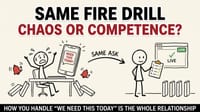
- What are the dates, and are they public? Start, end, and announcement. If any of the three is vague, fix it before launch, not after.
- Where can this confuse or feel unfair? Walk the edge cases. Do they have to buy? Can they enter twice? What happens if a winner does not respond? Confusion is the fastest way to turn a celebration into a complaint thread.
None of these are clever. All of them are uncomfortable, because they force you to replace a nice feeling with a specific commitment. That trade is the whole job.
Three ways the money flow quietly breaks
Even teams that buy into the napkin test still watch campaigns spring leaks. The flow looks clean on paper and then loses its dollar somewhere between the slide and the street. Three failure modes show up again and again.
The flow stops at the brand. This is the most common leak. The campaign drives attention, the attention drives followers, the followers drive a vague sense of goodwill, and the dollar that was supposed to reach the cause quietly stays inside the company. A discount that was already planned gets repainted as generosity. Watch for any campaign where the only measurable outcome is the brand's own metrics. If the brand is the only one who provably gains, the flow stopped at the brand.
The flow depends on a step nobody will take. A campaign promises to donate "a portion of proceeds" but buries the action three clicks deep, or asks people to upload a receipt, or requires a purchase during a week when money is tight. Each added step is a place the dollar can fall out of the pipe. The promo we built worked partly because the ask was a single tap: follow on TikTok. One action, no purchase, no friction. Every step you add between the person and the prize is a step where the flow can die.
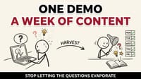
The flow is real but invisible. Sometimes the money genuinely moves and the brand forgets to show it. No announcement of who won. No follow-up on where the dollars landed. The campaign did the right thing and then hid the evidence, which from the outside is indistinguishable from doing nothing. If you moved money, prove it, publicly, with names and dates. The proof is not bragging. It is the part that builds the trust.
The fix for all three is the same discipline: trace the dollar past your own front door, remove every step you can, and publish the receipt. A money flow you can see is a money flow you can defend.
This is not really about Women's History Month
I am using a March campaign as the example, but the test does not care about the calendar.
Pride. Black History Month. Earth Day. Breast cancer awareness. A fundraiser for your local food bank. Any moment where a brand stands up and says "we support these people," the same question applies, and most brands cannot answer it.
Show me the money flow. Not the sentiment. The flow.
The brands people trust over time are not the ones with the best seasonal graphics. They are the ones who show their work. Who can point at the line on the napkin and say: here, this is exactly where the dollar went, and here is who caught it.
This is also where the term pink-washing comes from, and its cousins across every cause. The accusation is never "you cared too little." It is "you took the visibility and skipped the substance." The napkin test is how you make sure you are never the brand that earns that accusation, because you will have a literal drawing of where the money went.
Awareness is cheap. Anyone can post a banner. Moved money is the expensive, boring, trust-building part. It is also the only part that counts.
What this looks like when you get it right
When the campaign ran, the difference was visible in how people responded. The entry mechanic was obvious. The dates were clear. The prizes were real and achievable, so people actually entered instead of scrolling past another empowerment graphic. And the money did what we said it would: it moved toward women-owned brands, on the record, in a way you could point at.
That is the quiet win. Not a viral moment. A campaign that did exactly what it claimed to do, with receipts. Over a year, a brand built out of campaigns like that earns something no single splashy post can buy: the reputation of a company that means what it says.
That reputation is the actual asset. The graphics are disposable. The trust is not.
What to do before your next campaign
Pick the next "awareness" thing on your calendar. You already know which one it is.
Before you brief a designer, before you pick a color, before anyone in the room says the word "empower," get a napkin.
Draw the money flow. Label every hop. Be honest about where the line goes fuzzy.
If it does not clearly benefit the people you say you are celebrating, you are not ready to launch. You are ready to start the actual work, which is the part everyone else skips and the part that makes you the brand people come back to.
At Chykalophia, this is the kind of thinking we bring to the campaigns and digital experiences we build with clients: less moodboard, more mechanics, with a money flow you can actually trace. If your next campaign needs to do more than look good, that is the conversation we like having.
So, one question to take with you:
What is the last awareness campaign you saw that actually changed where a dollar went? And could you draw it on a napkin?