When Your Board Reviews a Moodboard Like It's the Homepage: A Guide to Design Governance That Actually Ships
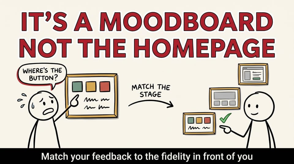
Table of contents
A board member looked at our moodboard and asked why the donate button was in the wrong place.
There was no donate button. There was no button at all. It was a moodboard. Color, type, texture, a couple of photos, the feeling we were going for. Not a single piece of it was the actual website.
But that is not how the room saw it. The room saw a homepage. A slightly weird, unfinished homepage, sure, but a homepage. So the feedback came in like it was a homepage. Move that. Cut that. Why is that photo so big. Where does the donor click.
Here is what actually happened, and why I think it is one of the most common and most expensive mistakes in any creative project. It is also completely fixable, and the fix costs you one page and a little discipline.
The Lynn Sage project
We were working on the website for the Lynn Sage Foundation, a breast cancer research nonprofit. Good mission, engaged board, real stakes. The kind of project where you want everyone bought in, because the people reviewing the work also raise the money the work is supposed to serve.
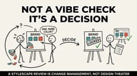
Early on, we did what we always do. We shared direction before we shared design. Moodboards and stylescapes. The point of that early work is not to show the site. It is to answer one question: does this feel like us?
We had two directions on the table. One leaned into bolder brand colors, more energy, more contrast. One leaned into softer, warmer tones, more comfort, more calm. Both were legitimate. The whole reason to look at a moodboard is to have that conversation, out loud, before anyone has built anything expensive on top of the wrong feeling.
That is not the conversation we got.
Part of the board looked at the boards and saw the finished homepage. So the notes came back about layout and copy. Is that the real headline. Should the button be higher. Why is there so much white space. Can we see it on mobile. All reasonable questions in the right meeting. All aimed at the wrong target in this one.
None of it was about tone, or brand feeling, or emotional direction, which was the entire job of the artifact in front of them. We had asked "does this feel like Lynn Sage," and the room had answered a question we had not asked yet: "is this the final website, and do I like where things are placed?"
This is a framing failure, not a board failure
It would be easy to tell this story as "the board did not get it." That is the lazy version, and it is wrong. It is also the version that quietly poisons the client relationship, because it turns the people you need on your side into the problem.
The board did exactly what people do when you put a visual in front of them without telling them what it is. They reacted to what they saw. If it looks like a webpage, people review a webpage. Of course they do. You would. I would.
That was on us. We handed them an artifact without handing them the instructions for how to read it. We assumed a shared vocabulary that we had never actually taught. Inside our studio, everyone knows a stylescape is not a layout. To a board member who runs a foundation and reviews a website twice a year, that distinction does not exist unless someone draws it.
Here is the thing about design work, or really any creative work that gets reviewed by a group. Every artifact has a job. The moodboard has a job. The wireframe has a job. The high-fidelity comp has a job. And each of those jobs asks a completely different question of the people in the room.
When you do not name the job, the room defaults to the most obvious one: is this the final thing, and do I like it? That default is where projects go to die. Or at least where timelines bloat, budgets leak, and approved work gets reopened for the third time.
The fidelity ladder
After the Lynn Sage review, we tightened up how we frame every stage. I think of it now as a ladder, where each rung asks a different question, and you do not get to climb until the rung you are standing on is solid.
Rung one: moodboards and stylescapes ask "does this feel right?"
This is tone, brand expression, emotional direction. Color families, typography personality, photographic style, the overall temperature of the thing. There is no real content here and there is not supposed to be. If a moodboard has a headline on it, treat the headline as a placeholder texture, not a copy decision.
The only feedback that helps at this rung: does this feel like us, and which direction feels more right? If you are aligned here, you climb. If you are not, you would much rather find out now, before structure and layout get built on top of a feeling nobody actually agreed to.
Rung two: wireframes ask "does this flow right?"
Structure, hierarchy, sequence. What comes first, what comes second, whether the donor journey actually makes sense from landing to gift. On purpose, wireframes are ugly. Gray boxes, no color, placeholder text, no polish. That ugliness is a feature. It keeps the conversation on flow instead of finish.
The trap at this rung is people reacting to the gray. "It looks so plain." It is supposed to. Color and copy are not the question yet. The question is whether the structure supports what the organization is trying to get someone to do.
Rung three: high-fidelity comps ask "does this look right?"
Now we talk typography, spacing, imagery, the exact shade of the button, how it behaves on mobile. Now pixel feedback is not just welcome, it is the entire point. This is the rung where "the button should be higher" is a useful sentence.
The mistake is never that someone gave feedback. The mistake is giving comp-level feedback on a moodboard, or moodboard-level feedback on a comp. You cannot answer "does this look right" about something that was never meant to look like the final thing. And you should not still be relitigating "does this feel like us" when you are supposed to be locking pixels.
Match the feedback to the fidelity in front of you, and the whole process gets calmer and faster. Mismatch it, and every meeting turns into a negotiation about what you are even discussing.
The one page that fixed it
The actual fix was almost embarrassingly small. We now put one page at the front of every review deck, before anyone sees a single visual. Here is the template, and you can steal it directly.
What this is: [Name the artifact and its job. "These are two stylescapes exploring brand direction."]
What this is not: [Kill the wrong assumption before it forms. "This is not a layout. Nothing here is placed where it will live on the real site. The words are placeholders."]
What we need from you today: [One decision. "Tell us which direction feels more like our organization. That is the only decision we are making in this meeting."]
What comes next: [Show the ladder. "Once we lock direction, we move to wireframes, where we will ask you about structure and flow. Color and copy get decided later, in comps."]
That is it. Four lines, and the fourth is optional. It changes the meeting completely.
Because now the room is not guessing what they are looking at. They know the job of the artifact, so they can do their job as reviewers. The feedback lands where it is useful instead of scattering across every fidelity level at once. And when someone does drift, you have a shared reference to point back to instead of an awkward correction.
The board-packet questions
If you lead or advise on a brand or website project, the single highest-return thing you can do is put better questions in front of your reviewers before they open their mouths. We now include three in every board or committee packet.
1. At this stage, what kind of feedback is most helpful, and what will we handle later? This does the framing work for you. It tells a busy board member where to aim, and it gives you permission, in advance, to park off-fidelity notes without seeming dismissive.
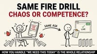
2. Which donor or user stories should we hold in mind as we look at these screens? This pulls the room out of personal taste and back into the mission. "I do not like blue" becomes "will a first-time donor trust this." That is a much better conversation, and it is the one that actually protects fundraising.
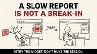
3. What would make you comfortable saying yes, move forward, today? This is the most important one. Most review meetings never actually ask for a decision, so they never get one, and the project stalls in a fog of soft opinions. Naming the decision you need converts a talent show into a checkpoint.
Run the review like a decision workshop, not a design talent show
The format of the meeting matters as much as the artifacts. A design talent show is a meeting where you present pretty things and collect reactions. A decision workshop is a meeting where you frame a choice, gather feedback at the right fidelity, and leave with a documented decision.
The difference is mostly in how you open and close. Open with the one-pager, out loud, before the visual. Close by stating the decision back to the room: "So we are aligned on the warmer direction, and we are moving to wireframes next. Anyone not comfortable with that?" Then write it down and send it out. A decision that is not written down is a decision that gets reopened.
One more move that pays off: involve one or two board members early, as thought partners rather than last-minute approvers. People who helped shape the direction do not ambush it at the finish line. The most expensive reviews are the ones where someone sees the work for the first time in round four and reopens a question you closed in round one. This is the same discipline I wrote about in the bravest thing you can do under a deadline is move it: protect the outcome by being honest about the process, early and out loud, instead of grinding through a plan that stopped serving anyone.
Why this is fundraising infrastructure, not bureaucracy
Solo clients drift into fidelity confusion too, but it gets much worse in a group. A board or a committee is a room full of smart, busy people who care deeply about the mission and only see the project at review checkpoints. They are not living in the work. They parachute in, see a visual, and react. If five people each review at a different fidelity, the person leading the project walks out with a pile of contradictory notes and no actual decision, then spends the next two weeks reconciling opinions instead of building.
For mission-driven organizations especially, this is not a small thing. Your review process is part of your fundraising infrastructure. A website that ships on time and speaks to donors is money in the door. A website stuck in its ninth round of board notes is a cost, a morale problem, and a delay on every dollar it was supposed to raise. The governance around your creative work is not separate from the mission. It is the machine that decides whether the mission gets a working website this quarter or next year.
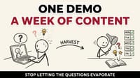
This connects directly to what the site actually says once it ships. Getting the review process right is how you protect a donor-first message all the way from direction to launch, instead of watching it get diluted by rounds of mismatched feedback. If that part is on your mind, I wrote a companion piece on why your homepage should talk to the donor, not about the organization, including a five-minute audit you can run on your own site.
Design governance is not bureaucracy. It is the difference between shipping and spiraling.
What you can do on your next review
You do not need a new process or a new tool. You need one page and a little discipline.
Before your next review meeting, write down three things about whatever you are about to show. What it is. What it is not. The single decision you need from the room today. Put it on the screen first. Say it out loud. Do not show the visual until everyone knows how to read it.
Then hold the line in the meeting. When someone gives you button feedback on a moodboard, do not absorb it as a task. Redirect it. "Great note for when we are in comps. Today I need to know if this direction feels like us." Capture the off-fidelity notes in a parking lot so people feel heard, and bring them back at the rung where they belong.
That one habit will save you weeks. I have watched it save us weeks. Approved work stops getting reopened. Reviews stop being a talent show and start being what they were supposed to be, which is a decision.
The design was never really the problem. The problem was that nobody told the room what they were looking at.
Want help building this into your project?
At Chykalophia, we build websites for mission-driven organizations and the review process that gets them shipped. If your last redesign spiraled through endless rounds of board feedback, the fix is usually not more design talent. It is design governance: the ladder, the one-pager, and the meeting format that keeps feedback at the right fidelity.
If you want a second set of eyes on how your organization reviews creative work, reach out through the site. I am always happy to look at where a project is getting stuck and tell you honestly whether it is a design problem or a framing problem. Most of the time, it is framing.
What stage on your projects keeps getting reviewed like it is the final build? That is usually the one worth fixing first.