Topic · 7 articles
Brand Strategy
Brand systems, design reviews and messaging that hold up in real use.
 Leadership
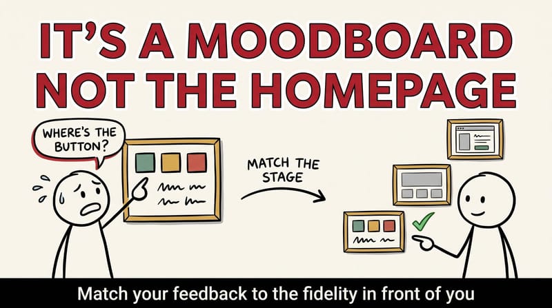
When Your Board Reviews a Moodboard Like It's the Homepage: A Guide to Design Governance That Actually Ships
A board member asked why the donate button on our moodboard was wrong. There was no button. It was a moodboard. Here is the fidelity ladder, one-page review template, and board-packet questions that stop early design work from getting reviewed like a finished homepage.
 Leadership
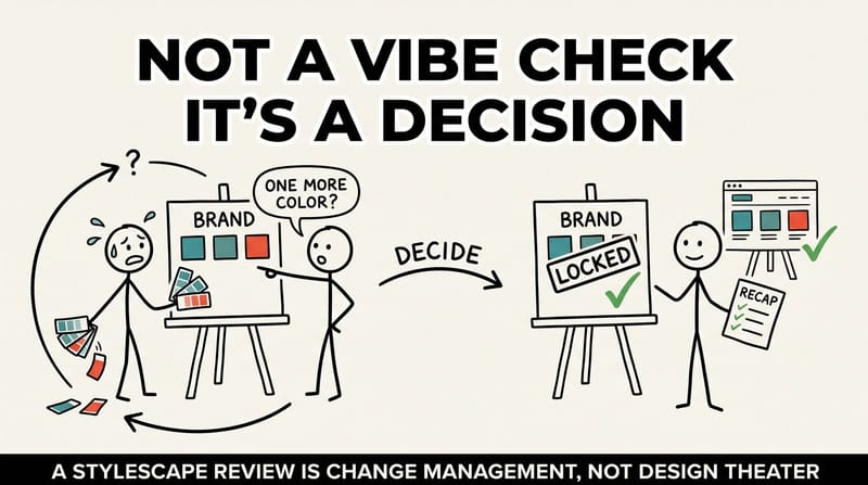
Your Stylescape Review Is Change Management, Not Design Theater
A stylescape review is not a vibe check. It is the moment your brand decisions get locked in or quietly reopened. Here is how to run it as the governance moment it already is: define decisions, name trade-offs, and send a decision recap that makes them stick.
 Entrepreneurship
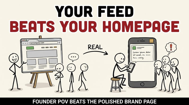
Your Founder's LinkedIn Feed Is a Better Landing Page Than Your Homepage
Our best-performing campaign last quarter wasn't a campaign. It was a founder rant on LinkedIn. Here is why raw founder POV content earns more B2B trust than the polished homepage you spent weeks building, and the 3 questions that surface your next five posts.
 Brand Strategy
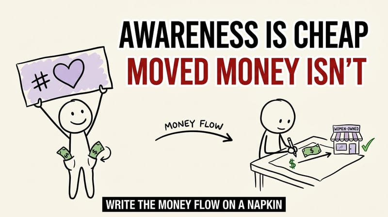
Write the Money Flow on a Napkin: How to Run a Cause Campaign That Actually Moves Money
Most cause campaigns stop at the moodboard. Here is the test we run instead: write the money flow on a napkin. If you cannot draw a clean line from the campaign to a real dollar landing with the people you say you are celebrating, you do not have a campaign yet.
 Business Strategy
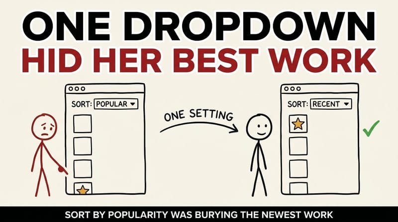
The Setting That Was Quietly Burying Her Best Work
A bridal brand's newest gowns were nearly invisible on their own site because of one sort-order default. Why small UX and ops choices decide whether your best work gets seen, plus the exact audit checklist we use.
 Business Strategy
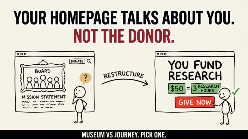
Your Homepage Is Talking About You, Not To The Donor: A Donor-First Redesign Playbook For Nonprofits
Most nonprofit homepages are a museum of accomplishments. The ones that grow donor revenue read like a donor journey. Here is the sitemap shift, the two-hero A/B test, the Ways to Support hub, and the 5-minute audit you can run on your own homepage today.
 Brand Strategy
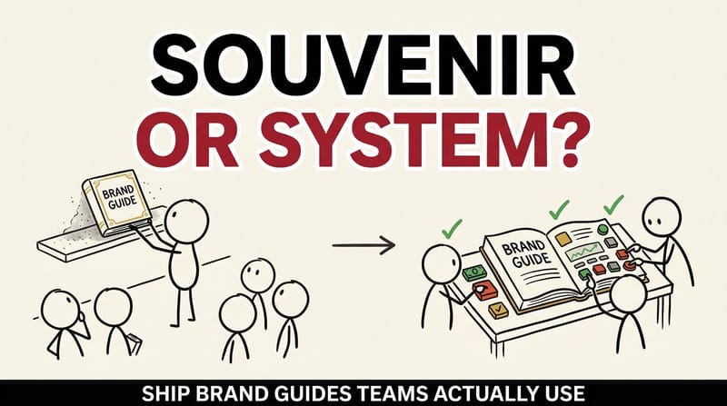
Brand Guides as Operating Systems, Not Souvenirs: How to Ship Brand Kits That Teams Actually Use
Most companies have brand guidelines. Far fewer have guidelines their sales team, vendors and AI tools can work from on an ordinary Tuesday. Here's how I'd turn the launch-day PDF into a kit people actually reach for, with a 25-item checklist.