CTO · Tech Strategist · Speaker · Nerd · Dad
Practical, honest thoughts on living a good life.
Freshest articles
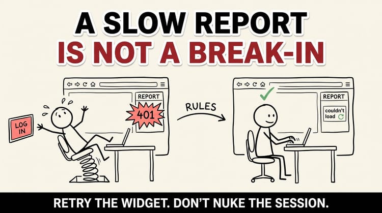
Stop Logging Out Your Best Users in the Name of Security
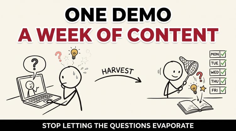
Your Client Demo Is a Week of Content Waiting to Happen
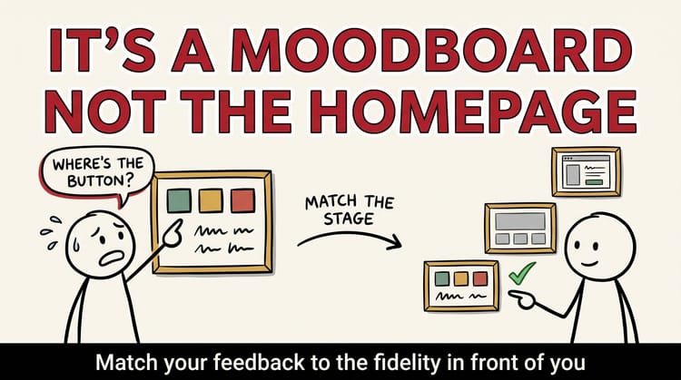
When Your Board Reviews a Moodboard Like It's the Homepage: A Guide to Design Governance That Actually Ships
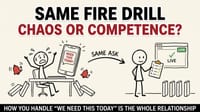
The Fire Drill Test: What "We Need This Today" Reveals About Your Team
How We Made a Healthcare Tracker Feel Trustworthy (Without a Single Flashy Feature)
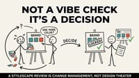
Your Stylescape Review Is Change Management, Not Design Theater
Your Founder's LinkedIn Feed Is a Better Landing Page Than Your Homepage