Your Homepage Is Talking About You, Not To The Donor: A Donor-First Redesign Playbook For Nonprofits
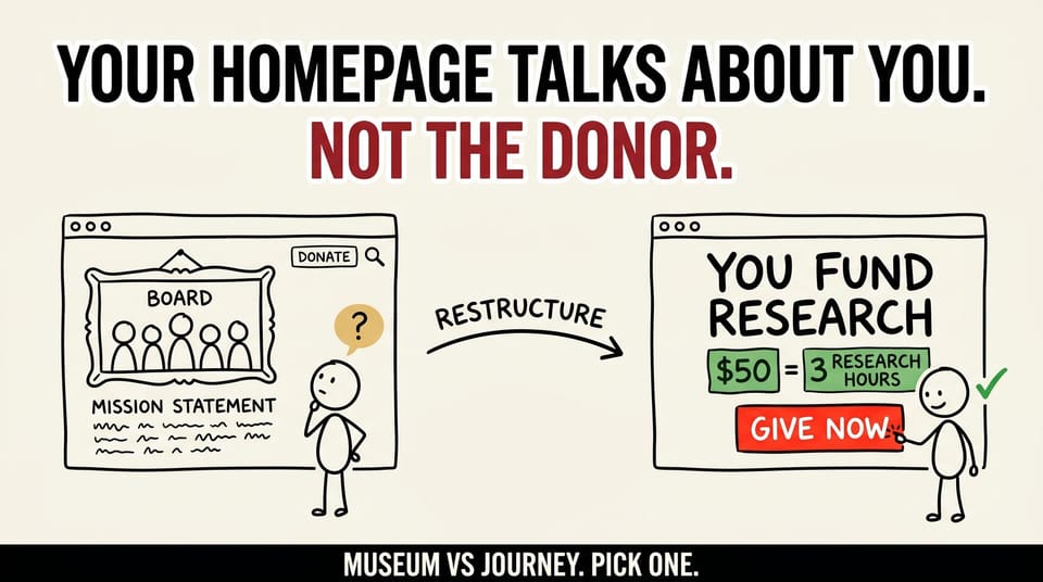
Table of contents
Most nonprofit homepages are a museum of accomplishments.
Mission statement at the top. Org chart in the menu. Annual report PDFs. Photos of the board. A "Science in Action" tab three clicks down. A donate button that lives quietly in the upper-right, the same size as the search icon.
That layout tells a story about the org. It does not tell a story to the donor.
For the last quarter, our team has been deep in a website strategy and redesign for a cancer-focused nonprofit. The work touches sitemap, homepage, donation experience, stylescapes, and content strategy. The first decision we made, before we wrote a single line of copy or moved a single pixel, was to admit that the existing site was a museum and to plan a path away from it.
This piece is the full playbook of what we changed and why. If you lead a nonprofit, sit on a board, or are the marketing or development director who inherited a website that does not convert, this is for you. You can read it as a case study, copy the audit, or take the sitemap and hero structure and bring them to your team next week.
Why most nonprofit homepages are museums
The museum problem is not because nonprofit teams are bad at marketing. It is because the org's internal language is, by default, about the org.
When the executive director writes an internal memo, it is about the team, the mission, the year. When the board reviews the website, board members notice their photo, their committee, their named programs. When the development director writes a fundraising email, the email is, by professional habit, about the program.
Multiply that gravity by years of incremental updates and you get a homepage that mirrors the org chart.
It is not malicious. It is just the path of least resistance.
The cost is invisible until you measure it. Nonprofit homepages that read like museums have a few common symptoms.
- Donate buttons are visible but not contextual. The button is in the nav, but nothing around it explains why to click.
- Impact stats live on a separate Impact page that donors find at a 10 to 15 percent rate, if at all.
- The donation form is a generic third-party widget bolted onto a static page, with the org's own visual language nowhere in sight.
- Different giving types (individual, recurring, tribute, institutional, planned, event) live on separate, mostly-orphaned pages.
- Heroes and homepage sections are organized by org structure (About, Programs, News) rather than donor decision (why give, how it works, where the money goes, next step).
If three or more of those are true on your site, you are working from a museum.
The framing shift: museum to donor journey
The internal framing we use with leadership teams is simple. Stop describing yourself. Start describing the donor's next move.
That sentence sounds small. It is not.
When the homepage's job description shifts from "tell the world about us" to "help the donor take their next step," every downstream decision changes. The sitemap changes. The hero changes. The donate experience changes. The internal arguments change.
The board photo is still on the site. It is just not the first thing the donor sees.
The mission is still on the site. It is no longer the headline.
The annual report is still on the site. It is no longer in the primary nav.
What replaces them, in the first scroll, is something closer to a contract with the donor. Who you help. How your gift works. Where the money goes. What the next step looks like.
The sitemap rewrite (the most important change)
If you only do one thing from this piece, do this.
Open a doc, pull up your current sitemap, and ask, for each top-level menu item: "Is this answering an org question, or a donor question?"
Most nonprofit sitemaps look like this.
About > Programs > Research > News > Events > Donate.
That is an org chart pretending to be a navigation. It is structured the way the org is structured internally. The donor has to translate.
The sitemap we moved to, on this redesign, looks closer to this.
Your impact > How your gift works > Ways to support > Stories of hope > About us > Donate.
Two things change at the structural level.
First, the order is flipped. The donor's questions come first. The org's introduction comes near the end. About us is not the front door anymore. It is the corroborating evidence the donor visits after they have decided to engage.
Second, Donate stops being a single tab. Donate is present on every page (a persistent button or floating CTA), with the form embedded or one click away depending on context. The dedicated Donate page exists, but it is no longer the only on-ramp.
If your sitemap survives a "donor question or org question" pass, you can skip the redesign. Most do not.
The two-hero question and how to settle it
Every nonprofit homepage has a hero. Hero photo, hero headline, hero CTA. Two strong opinions tend to show up about what the hero should do.
The first opinion says: put the donation form directly in the hero. The donor who arrived ready to give should not have to hunt. Three fields, an amount, a submit button. No friction.
The second opinion says: the hero is for emotional commitment, not transactional friction. Lead with a strong image and headline, and route donors who are ready into a dedicated donation flow that can do the work properly (recurring options, tribute gifts, employer matching, stock and DAF transfers).
Both are defensible. The cost of letting that argument run for 12 weeks in committee is much higher than the cost of building both.
What we did on this project was design both hero variants in parallel, with the same brand language, the same hero photography style, and the same hierarchy of trust signals.
Variant A: hero with embedded donation form. Single dollar amount selector, three preset values plus a custom field, recurring option as a checkbox, name and email, card.
Variant B: hero with a strong CTA into a dedicated donation flow. The CTA opens a designed donation page where the form has room to breathe, the dollar-to-outcome math is on the page, and tribute and recurring and DAF options have proper screen space.
Both variants share a secondary CTA: "Other ways to give" routing into the Ways to Support hub.
The plan is a real A/B test on live traffic, measuring conversion rate, average gift size, recurring rate, and assisted conversions through email and ads. The decision is the data, not the meeting.
If your team is in a hero argument right now, the cleanest move is almost always to ship both and let the donors vote.
The "Ways to Support" hub
The Ways to Support hub is the part of this project that paid back the most operationally, for the smallest design investment.
The problem the hub solves is simple. Donors who want to give in any way other than "credit card on the homepage" used to have to know the org chart to find their option.
Stock gifts? Buried on a static page nobody could find.
Donor-advised funds? On a partner page.
Recurring? Inside the donation form, hidden behind a checkbox.
Tribute or memorial? Under About > In Memoriam.
Institutional or corporate? Under Partners > Sponsorship.
Events? Under Events > Sponsorship Opportunities.
That is six different mental maps a donor needs to hold in order to find the right giving path. The donor mostly does not. They click Donate, they pick credit card, and any other intent silently dies.
The hub consolidates every giving path into a single page that does three things.
- Lists every giving type plainly, with one sentence on who it is for.
- Surfaces the friction up front. Stock gifts are not instant. Tribute gifts require a note. DAF gifts have a separate routing email. The donor learns this before they start, not after they are halfway through.
- Routes each path to a dedicated, properly-designed page that handles that giving type with respect.
Six lonely orphan pages become one front door that triages.
The cost of the hub is one page of design and roughly a week of internal alignment. The return is every "other" donor intent stops dying silently.
Pull impact close to the donation path
The last move I want to call out, and the one that I would advocate for hardest at most nonprofits, is closing the loop between "what your gift funds" and the donation form.
On most nonprofit sites, the Donate page is a form. Name, email, amount, card, submit. The "what your gift funds" content lives on a separate Impact page or inside the annual report.
On this redesign, the Donate page sits next to two things.
A dollar-to-outcome panel: "this dollar amount equals this many research hours, this many treatment kits, this many family support sessions." It is specific. It is not a generic "every dollar counts" platitude.
A short Science in Action story: a real research project, a real research team, a real outcome the donor's money is paying for, written in plain language.
The point is not to manipulate. The point is to close a loop that, in most nonprofit sites, never closes. The donor on the Donate page is one click from saying yes. The best moment to remind them what they are saying yes to is right there, not in the email confirmation three weeks later.
Conversion lifts from this kind of in-context proof tend to be measurable. More importantly, donor retention rates trend up when the donor's first gift comes with a clear memory of what they funded.
The 5-minute homepage audit
You can run this audit on your own homepage right now. You do not need a designer. You do not need a copywriter. You do not even need permission.
Step 1. Open your homepage on your laptop in a private window (so you see what a first-time donor sees).
Step 2. Take a screenshot of just the top fold. The part the donor sees before scrolling.
Step 3. Print the screenshot, or pull it into a slide.
Step 4. Draw three boxes around the main elements in the screenshot. Hero. Secondary block. Tertiary block.
Step 5. Label each box with exactly one of these three labels.
About us.
About our impact.
About the donor's next step.
Now look at the labels.
If all three boxes are some flavor of "About us," your homepage is fully a museum.
If two of three are "About us" and one is "About our impact," your homepage is a museum with a wall plaque.
If one of the boxes is clearly "About the donor's next step," you are most of the way there. Sharpen it.
If two or more boxes are clearly "About the donor's next step," your site is doing the right thing structurally. You can spend the rest of your time on copy and design polish.
This is not a perfect diagnostic. It is a fast one. It surfaces the structural problem in five minutes, and it gives your leadership team a shared artifact to look at together. That is usually the unblock.
Frameworks: questions to ask before you start
If you are about to commission a redesign, or you are an in-house team about to start one, here are the questions I would walk every stakeholder through before a single page is wireframed.
- Who is the donor we are designing for? Be specific. Age, relationship to the cause, primary giving moment.
- What does that donor see on a first visit, in the first 5 seconds? Not what we want them to see. What they actually see.
- What is the donor's next step, plainly stated, on the homepage? If it is not "donate," what is it, and where does it go?
- Where do donors actually enter the site (homepage, blog, campaign landing, paid ads)? The current homepage is only one of several real entry points. Plan for all of them.
- What are we willing to A/B test? If the answer is nothing, the redesign is going to lock in the next argument for three years. Pre-commit to at least one real test.
The teams I have worked with that answer those five questions out loud before the design phase tend to ship redesigns that hold up. The teams that skip them tend to ship beautiful sites that quietly fail to grow donor revenue.
What a board conversation about this looks like
If you are reading this and you are the one who is going to have to sell this internally, here is the framing I would use with a board.
Open the conversation with the 5-minute audit. Bring printed screenshots of the current homepage with the three boxes drawn on them. Do not editorialize. Let the artifacts do the work.
The board photo is not the enemy. The org chart is not the enemy. The annual report is not the enemy.
The enemy is the homepage doing the wrong job.
The homepage's job is to help the donor take their next step. The board page can still exist. The annual report can still exist. They just do not get to be the front door.
That reframe is usually what unsticks a board on a redesign vote.
A small note on language
A donor-first homepage is not a marketing trick. It is not "make the site shinier so we can extract more dollars." It is a respect move.
The donor showed up. They came looking for a way to help. The site's job, in that moment, is to make help possible, fast, and clear.
A museum is a fine thing. The Smithsonian is a museum. People love museums. But people do not arrive at the Smithsonian wondering how to give the Smithsonian fifty dollars and have it turn into a research hour.
Your nonprofit homepage is not a museum. It is a front door.
Design accordingly.
Want help running this audit on your own site?
If you read this and want a second pair of eyes on your homepage, the audit is something I am happy to do over a 30-minute call. Send me a link to your site and a sentence about the donor you are trying to reach.
You can also subscribe to the Substack for the rest of the donor-first website series, including the Ways to Support hub blueprint, the donation page conversion teardown, and a real-traffic A/B test result piece coming once this project's two hero variants have read out.
If you are working on a redesign right now and want a strategy partner, my team works with nonprofits on exactly this kind of donor-journey redesign. The first conversation is free. Reach out: [email protected]
The short version of this piece is on Substack: subscribe to get the next pieces in the series.