Your Stylescape Review Is Change Management, Not Design Theater
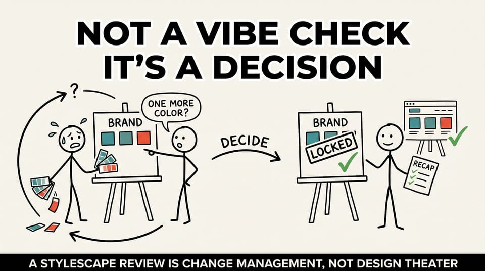
Table of contents
A stylescape is supposed to be the easy meeting.
You put the palette, the typography, the photography direction, and a few sample layouts on a board. Everyone nods. Someone says "I love the warmth." You move into the real work of building the thing.
That is the theory. Here is what actually happens in most organizations.
The team treats the stylescape like a vibe check. Pick the look you like, move on. The board treats it like a surprise. Wait, when did we agree to this? And three weeks later, after the designers have started building real pages, someone asks the question that quietly torches the timeline.
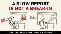
"Can we just try one more color?"
I have watched that single sentence cost more design weeks than any blown deadline I can remember. And the frustrating part is that it is almost never really about the color. It is a symptom. It tells you that the review where everyone nodded never actually decided anything.
This is the reframe I want every founder, CMO, and brand lead to make: a stylescape review is not design theater. It is change management in disguise. Treat it that way, and the "one more color" problem mostly disappears.
The stylescape is the decision, not the deliverable
Most people file the stylescape under "creative output." It looks like art, so it gets reviewed like art. Do I like it. Does it feel like us. Thumbs up or thumbs down.
But look at what is actually on the board. The color palette your organization will use on every page and every printed piece. The type system that will set the tone of every headline. The photography direction that decides whether you look warm or clinical, established or scrappy. How the logo lives on a tote bag, a homepage hero, an annual report, a conference banner, a social tile.
You are not choosing a favorite look. You are committing an entire organization to how it shows up across every touchpoint for the next 12 to 18 months. That is a governance decision wearing a designer's outfit.
And here is the rule that holds across every project I have seen: if you run a governance decision like a show-and-tell, you get show-and-tell outcomes. Polite nods in the room. Quiet second-guessing in the hallway after. A board member who was never really in the loop, reopening the entire question in a later meeting because they never got a genuine chance to react the first time.
The work is not the slide. The work is the decision the slide is supposed to lock in.
Why teams misread the moment
Two failure modes show up again and again.
The first is the vibe check. The internal team treats the review as a taste test. They show three directions, ask which one people like, and read the room. The problem is that taste is reversible by whoever speaks loudest next. A preference has no shelf life and no reason attached to it, so it can be overturned by the next strong opinion that walks into the building. Nothing was decided, so everything stays open.
The second is the surprise. The board or the executive committee sees polished work for the first time, with no framing about what is open and what is closed. Faced with finished-looking output they had no hand in, smart people do the natural thing. They poke at it. They suggest alternatives. They ask to "see one more." Not because the work is bad, but because reopening is the only form of participation you left them.
Both failure modes come from the same root cause. The review was run as a presentation instead of a decision process. Nobody named what was being decided, who got to decide it, what was still open, and what would close after the meeting.
I wrote a whole piece on a cousin of this problem, the way teams over-celebrate the hero slide instead of the decision behind it. If that pattern sounds familiar, it is the same disease in a different room: the hero slide problem.
Two reviews, one lesson
Let me give you two anonymized field versions, because the specifics are where the lesson lives.
The first was a faith-based nonprofit going through a full rebrand. Discovery, messaging, personas, UX, logo exploration, all of it. Multiple rounds of feedback on logo directions and color palettes, and on how the mark would live on real assets, not just a slide. Tote bags. The site hero. Printed materials. Social.
The work was never "pick your favorite look." It was aligning leadership around three questions: who this brand is for, what promise it is making, and how it shows up across every touchpoint. The stylescape was the moment those answers got pinned down or stayed fuzzy. Every round that drifted back to taste, instead of holding on the decision, added a week. Every round that named the decision moved the project forward.
The second was a research-focused nonprofit with a real fundraising board and a marketing and communications committee. The stylescape explored a warmer secondary palette, some gradients, circular motifs, and new typography aligned to the existing logo. But the reason it worked had nothing to do with the design being prettier.
The team refused to pretend the board did not exist. They built a deliberate one-week window for the board and the committee to react before any high-fidelity design began. They were explicit about what was open and what was not. They even pre-resolved a tension out loud: the research-focused pages would stay minimal and rigorous, while the general pages could carry more warmth and pull a signature accent color through subtly, in stats, accents, and icons.
Then they sent a recap. A short, plain-language note that said what was decided, what stayed open, and what happened next. One week to react, a clear line between open and closed, and a written record afterward.
That is not design theater. That is a leader running a change-management process and calling it a stylescape review.
The three shifts that turn a review into a decision
None of these are clever. All of them are slightly uncomfortable, which is usually how you know they are doing real work.
1. Define decisions, not preferences
The sentence has to change. Not "I like the blue." Instead: "After this meeting, we are committing to this palette, this type system, and this photography direction for at least the next 12 to 18 months."
A preference is a mood. A decision has a shelf life and a stated reason. When you frame the output as a commitment with a time horizon, you force a different quality of attention. People stop reacting to whether they personally like it and start asking whether the organization can live inside it for a year and a half. That is the right question, and most reviews never ask it.
2. Name the trade-offs out loud
Every brand decision is a trade-off, and the trade-offs do not disappear when you avoid saying them. They just move into the hallway and come back as "concerns" later.
So say them in the room. Warmth versus rigor. Donor-facing language versus internal language. A decorative flourish versus an accessible contrast ratio. Bold and memorable versus safe and broadly acceptable. When the trade-off is named and chosen on purpose, you stop relitigating it every time someone notices one side of it.
The research nonprofit did this well. They did not pretend you could be maximally warm and maximally rigorous everywhere. They decided where each one wins, page by page, and wrote it down.
3. Plan for the board's psychology
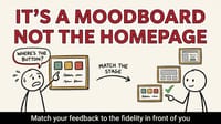
People reopen decisions they never felt part of. That is not a character flaw, it is human nature. The fix is not to hide the work from the board until it is too late to change. That just delays the explosion. The fix is to give them a bounded, real chance to weigh in, and then close the door cleanly.
Give them a PDF they can sit with. Tell them clearly what is up for debate and what is already settled. Give them a deadline to react. Then, when the window closes, it is closed, and you have the written guidance to point back to when someone wants to reopen it.
That single move, a defined feedback window with a clear open-versus-closed line, prevents more downstream chaos than any amount of additional design polish.
The artifact that makes it stick: the decision recap
Here is the cheapest, highest-return habit in this entire process. After the review, send a two or three paragraph decision recap.
It has four parts:
- What we decided. The palette, the type system, the photography direction, stated as commitments. "We are moving forward with X palette and Y typography."
- Why. One line of reasoning per major decision, tied to audience and goals. "This palette reads as warm and trustworthy to a donor audience while keeping enough contrast for accessibility."
- What stays open. The handful of things genuinely still in play, with who owns them and by when.
- What happens next. The next phase, the date it starts, and the bar for reopening anything that was just closed. "We begin high-fidelity design on the 14th. We will not reopen core palette or typography without a major strategic reason."
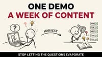
That recap is not busywork. It is the thing that stops someone "remembering it differently" next month. It turns a meeting into a record. And a record is what lets you say, kindly and firmly, "we decided this on the 7th, here is the note, what changed strategically since then?" when the "one more color" question shows up.
This is the same discipline I wrote about when we moved a project's closure date out loud instead of grinding through it. The bravery is not in the grind. It is in naming the decision cleanly and committing to it in writing. If you want that story, it is here: the bravest thing you can do under a deadline.
The pre-review invite: three bullets
Most of the work happens before anyone walks into the room. Add three bullets to the calendar invite for your next stylescape review.
- Decision goal. "By the end of this meeting, we confirm palette, typography, and photography direction for the next 12 to 18 months."
- Feedback rules. "We are here to judge fit for the audience and the goals, not personal color favorites."
- Next phase. "Once approved, we move into high-fidelity design and we do not reopen the core palette or typography without a major strategic reason."
Three sentences. They reframe the entire meeting from "do you like it" to "are we ready to commit." That reframe is most of the battle.
Why this matters more in 2026
AI can generate a hundred brand directions in an afternoon now. That is real, and on balance it is useful. But it has done something specific to this problem: it made the easy part even easier and left the hard part exactly where it was.
AI can give you options all day. It cannot run your decision process. It cannot manage your board. It cannot sit with a fundraising committee and explain why the research pages stay rigorous while the campaign pages get warm, then hold that line three weeks later when someone wants to soften it. That work is leadership, and as the generation of options gets cheaper, the ability to decide and commit gets more valuable, not less.
When anyone can produce infinite directions, the scarce skill is convergence. Closing. Deciding. Writing it down and making it stick.
Brand as an operating system, not a mood board
This connects to a bigger shift I keep coming back to. Brand is moving from "aesthetics" to operating system. Not a folder of pretty assets, but a shared decision log that guides every website, every campaign, every printed piece, every social post. A system that lets a junior designer or an outside vendor make an on-brand decision without a meeting, because the decisions are already written down.
The stylescape review is where that operating system gets its first real entries. It is the moment the abstract brand strategy becomes concrete, committed choices that everything downstream inherits. If you run it as theater, your operating system is built on vibes. If you run it as governance, it is built on decisions you can point to.
I went deep on this idea in a separate piece on treating brand guides as operating systems. If the framing here resonates, that is the next thing to read: brand guides as operating systems.
What to do this week
You do not need a rebrand to use this. You need one upcoming review, internal or with a client, and a willingness to run it differently.
Before the meeting, write the three invite bullets. Decision goal, feedback rules, next phase.
In the meeting, say the trade-offs out loud and ask the real question: can we commit to this for the next 12 to 18 months. Not "do we like it."
After the meeting, send the four-part recap. What we decided, why, what stays open, what happens next.
Then watch what happens to the "can we try one more color" conversation. It does not vanish entirely, because people are people. But now it has somewhere to land. You have a record, a reason, and a bar for reopening. The decision holds because you treated it like a decision.
The leaders I trust most in brand and design are not the ones with the best taste. They are the ones who can walk a room from preference to commitment, name the trade-offs honestly, and make the decision stick long after the meeting ends.
That is the boring skill. It is also the one that protects the budget, the timeline, and the team.
At Chykalophia, we run brand and website projects as decision processes, not design theater, from stylescape through high-fidelity build and launch. If your last rebrand turned into an endless loop of "one more direction," that is usually a process problem, not a taste problem, and it is fixable. Let's talk about how we run it.