That "Cool" Mobile Design Is Quietly Killing Your Conversion Rate
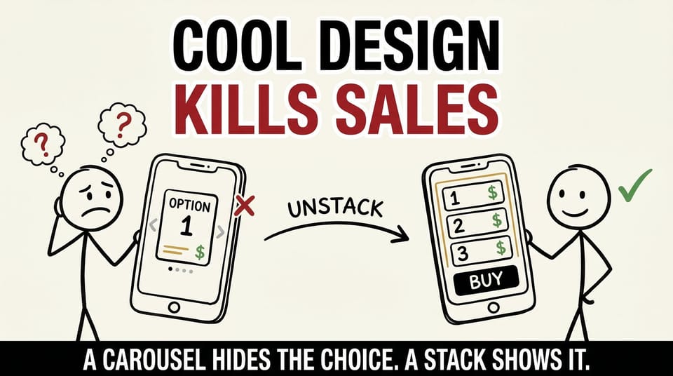
Table of contents
The vertical stack looked worse in the design review.
Three product options, stacked top to bottom, on mobile. No animation. No swipe. One of those layouts a designer half-apologizes for before they even put it on screen.
We shipped it anyway. And the reason we shipped it is the reason I am writing this whole post.
Because the most dangerous patterns on your website are not the ugly ones. The ugly ones get caught. Somebody flags them, somebody fixes them, everyone moves on. The dangerous ones are the slick, impressive, award-worthy patterns that look incredible on a 27-inch monitor and quietly murder conversion on a phone.
This is a post about how to spot them before they cost you money.
The decision nobody applauds
A few weeks ago, our team wrapped a round of UX work on a client's e-commerce store. Most of the work was exactly what you would expect from a product-page cleanup.
We brought the homepage hero typography and colors in line with the brand. We refined the product page in a dozen small ways: quantity selectors, rounded buttons, disclaimers in the right places, clearer icons, cleaner subscription copy. The boring, careful, high-value work that makes a store feel trustworthy instead of slapped together.
Then we hit one small fork in the road. On mobile, the three product options could go one of two ways.
The first way was a carousel. Swipe left, swipe right, one beautiful product card at a time. It demos great. It feels modern. It is the kind of interaction you would screenshot and drop into a case study.
The second way was a plain vertical stack. All three options, top to bottom, visible at once. No swipe. No animation. Boring in the way that a well-organized closet is boring.
We picked the boring one. On purpose. And I would make the same call ten times out of ten.
Why a carousel is a slot machine
Here is the core problem with carousels for anything that actually matters to the sale.
They hide choices. The entire interaction model assumes the customer will swipe to discover the rest of their options. And on a real phone, in a real moment, that assumption quietly falls apart.
Carousels hide options. Swipes get missed. People bounce before they ever see option three.
To understand why, you have to picture how people actually hold and use their phones. It is not how we use the design tool. It is one thumb, often the wrong thumb, frequently in motion. It is a person in line for coffee, on the couch with the TV going, walking down a sidewalk, sitting in a waiting room. They are not studying your page. They are scanning it for two or three seconds and making a snap decision about whether you deserve any more of their attention.
In that context, a carousel does something brutal. It shows option one and silently swallows options two and three. If your best-value bundle, your most popular tier, or your highest-margin product is sitting on slide three, it may as well not be on the page at all. The customer never swiped. They saw one card, assumed that was the whole offer, and left.
You did not lose that sale on price. You did not lose it on product. You lost it on geometry. On a design decision that looked great in the room where it was approved.
The vertical stack does the unglamorous opposite. Every option is in view. The customer can compare without working for it. The main button is impossible to miss. There is no hidden state, no "is there more," no interaction to discover.
Less fancy. More revenue. Once you say that trade out loud, it stops being a hard call.
The trap is an incentive problem, not a designer problem
I want to be careful here, because it is easy to read this as "designers make pretty things that do not work." That is not it, and it is not fair.
This is an incentive problem, and it is structural.
Think about where design gets evaluated. It gets reviewed on a large, high-resolution monitor, in a quiet room or a focused video call, by people who are paying full attention because reviewing the design is literally their job in that moment. On that screen, in that context, the carousel wins every comparison. It is smoother. It is more impressive. It signals craft and effort and modernity.
Then the work ships. And it lands on a small screen, held by a distracted person who is giving it a fraction of the attention the reviewers gave it. The exact thing that read as craft in the review now reads as a wall.
The design was never built to serve that distracted buyer. It was built, often without anyone intending it, to win the review. To survive the meeting. To look good in the portfolio. And "looks good in the portfolio" and "is easy to buy from on a phone" are genuinely different goals. Sometimes they point in the same direction. Sometimes they fight each other, and when they fight, the portfolio usually wins, because the portfolio is who is in the room.
That is the quiet part of "quietly killing your conversion rate." Nobody is sabotaging anything. Everyone is doing good work toward a goal. The goal is just slightly wrong, and the gap between "impressive" and "effective" is exactly where the revenue leaks out.
The red-flag list
After this project, I started keeping a short mental list of mobile patterns that tend to look cool in a review and convert badly in the wild. These are not rules. They are not "never do this." They are "pull this up on a real phone before you call it done."
Carousels for mission-critical choices
A carousel is fine for a gallery of lifestyle photos, where seeing every image is nice but not load-bearing. It is dangerous for anything the customer has to evaluate to make a decision. Pricing tiers. Core product options. Bundle choices. If a customer must swipe to see the thing they are choosing between, you have added friction to the single most important moment on the page. That is the worst possible place to add friction.
Tiny tap targets on the primary CTA
A button that is trivially easy to click with a mouse pointer can be a coin flip with a thumb. Thumbs are imprecise. They are big and soft and often in motion. The most important button on your page, the one that actually starts a purchase, should be the easiest target to hit, not a precision exercise that punishes anyone with average-size hands or a moment of inattention.
Copy that only works on a desktop monitor
Long, clever, three-line headlines breathe beautifully at full desktop width. On a phone, they wrap into a dense block, push your CTA below the fold, and bury the actual point under your own cleverness. Mobile copy has to survive a narrow column. If the headline only lands when it has room to spread out, it does not land where most of your traffic is.
Anything that requires the user to discover an interaction
This is the meta-pattern underneath the others. If your design only works once the customer figures out that they are supposed to swipe, tap, expand, or hover, you are betting your revenue on their curiosity. Here is the hard truth: most people are not curious about your site. They are busy. They will not hunt for the interaction. If the path is not obvious, for most people the path does not exist.
None of these patterns is automatically wrong. Plenty of great sites use carousels well, in the right place, for the right content. The point is not to ban anything. The point is that every one of these earns a second look on an actual device before it ships.
The ten-second test
If you take one thing from this post, take this. It is the test I now ask our team to run before we ship any page that is meant to sell something.
Pull it up on your phone. One thumb. Ten seconds.
Can you see every key option and the main CTA without thinking? Without swiping to find something important? Without scrolling past the thing that matters? Can a distracted person understand what to do and do it, fast?
If yes, ship it. If no, that is your next sprint.
It sounds almost too simple to be a real test. That simplicity is the entire value. The fancy interactions, the clever animations, the layouts engineered to win the design review, they all melt under ten seconds of real thumb time. What survives is the stuff that genuinely helps a human being decide and act.
I am not anti-beautiful. I want our clients' sites to look sharp, modern, and worth trusting. Beauty does real work. It signals quality and care before a single word is read. But beauty that hides the path to purchase is not a feature. It is a leak with nice lighting. The job is to be beautiful and obvious, not to trade one for the other.
How to run a real mobile audit
If you want to go past the ten-second gut check, here is the slightly more structured version. This is close to the checklist we walked through on the project.
First, test on a real device, not the browser's responsive mode. The responsive simulator in your design tool or browser is useful, but it lies in small ways. It does not replicate thumb reach, real screen glare, actual scroll physics, or how a slightly slow connection changes the experience. Hold the real thing.
Second, test one-handed. Most phone use is one thumb. If a key action requires two hands or a stretch to the top corner of the screen, that is friction you cannot see on a desktop.
Third, test distracted. Do not give the page your full designer attention. Glance at it the way a customer would, with half your brain somewhere else. The patterns that only work under full attention will reveal themselves immediately.
Fourth, find every hidden choice. Walk the page and ask: is there any option, price, or piece of information the customer has to perform an action to reveal? Carousels, accordions, tabs, tooltips, hover states. Each one is a place where a real option can disappear. Decide deliberately whether hiding it is worth it. Usually it is not, not for the things that drive the sale.
Fifth, check the path to the button. From the moment the page loads, how many thumb-actions does it take to get to "buy"? Count them. Every extra scroll, swipe, and tap between landing and purchasing is a place a distracted person can fall out. Shorten the path.
That is it. Five passes. Real device, one hand, distracted attention, hidden choices, path to the button. You can run it on your own most important page in about fifteen minutes, and it will almost certainly surface something worth fixing before your next sprint.
One more place this hides
The carousel is the cleanest example, but the same instinct shows up in other spots, and once you see it you cannot unsee it.
Sticky headers that eat a third of a small screen. They look tidy on desktop, where a third of the screen is still plenty. On a phone they shove your product and your button into a tiny remaining window, and the customer spends the whole visit looking through a mail slot.
Image galleries that demand a tap to enlarge before the product is actually legible. On a big screen the thumbnail is already clear. On a phone the customer cannot tell what they are looking at without an extra action, and a lot of them will not bother to take it.
Auto-playing video heroes that look cinematic on a fast office connection and turn into a stuttering, data-hungry mess on a phone with two bars. The customer does not see craft. They see a page that is fighting their thumb and their battery.
None of these is a crime. Each one is just a place where "looks great in the review" and "works for the buyer" quietly diverge. The carousel taught me to go looking for the others.
What this is really about
The carousel-versus-stack decision is small. One layout choice on one product page on one project. But it is a clean example of a much bigger pattern, and that pattern is worth naming directly.
Most teams optimize, without realizing it, for the version of their site that gets seen in reviews, screenshots, and case studies. The big-monitor version. The full-attention version. The version that impresses other people who build websites.
Your customers do not live in that version. They live in the small-screen, one-thumb, half-distracted, slightly-impatient version. And the gap between those two experiences is exactly where conversion quietly disappears.
The fix is not to make ugly websites. The fix is to move the moment of judgment. Stop asking "does this impress the room" and start asking "can a busy person on a phone decide and buy in ten seconds." When those two goals agree, great. When they disagree, the busy person on the phone wins, because the busy person on the phone is the one with the credit card.
Boring but obvious beats polished but hidden. On the device where most of your customers actually are, that is not a small edge. It is most of the game.
What you can do this week
You do not need a redesign to act on any of this.
Pull up your own product page on your phone right now. One thumb. Ten seconds. Be honest about what you can and cannot see without working for it.
If your key options are hidden behind a swipe, unstack them. If your main button is hard to hit, make it bigger and more obvious. If your headline turns to soup on a small screen, cut it until it does not. Then ask one more time: can a distracted person decide and buy, fast?
If you want help running this on your store, this is exactly the kind of work our team does. We do these mobile UX and conversion reviews as part of our web projects at Chykalophia, and the carousel decision in this post came straight out of one. If your product page feels great on your laptop but you are not sure what it does to a thumb, that is a good conversation to have.
What is one "cool" thing on your site that might be quietly costing you sales? Pull it up on your phone and find out before your customers decide for you.