Your cause-month campaign needs a hero, not just a hashtag
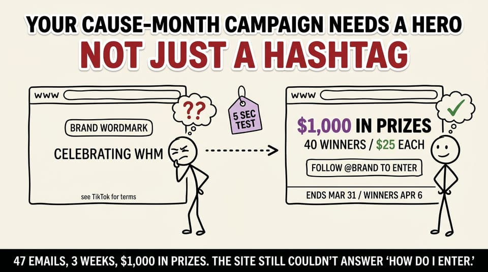
Table of contents
47 emails. Three weeks of back-and-forth. $1,000 in prizes ready to give away.
The brand's homepage still couldn't tell you who the giveaway was for, how to enter, or when it ended.
That was a Women's History Month campaign we shipped for a DTC client in March. The TikTok ad was running. The hashtag was moving inside their niche. The campaign was technically "live."
The site, the one place a shopper actually lands and decides anything, was doing none of the closing work.
I am writing about this in May because Pride Month starts in two weeks, AAPI Heritage Month is already in motion, Mental Health Awareness Month is also already in motion, and at least three founders I talked to last week are planning some version of the same mistake. The cause does not matter. The category does not matter. The lesson is the same.
This is the longer breakdown of the Substack post on the same topic, with the full four-fix audit, the operator checklist you can run on any campaign brief before you sign off, and the principle that connects this to every other pipeline conversation I have had with a founder this year.
Section 1: What the campaign looked like from inside
Let me set the scene because this part matters. The mistake is not unique to one client or one cause. The mistake is structural.
A DTC brand was running a TikTok giveaway tied to women-owned brands at Macy's and CVS. $1,000 in prizes split across 40 winners, $25 each. The mechanic was "follow on TikTok to enter." End date March 31. Winner announcement April 6.
That sounds clean when you write it down. Inside the working files, it was not clean.
The first hero visual the client got back was rejected on a Tuesday. It was the third concept the founder had rejected. The reasons made sense (the design did not feel like the founder's brand, the color story leaned the wrong way), but each rejection added a week, and the campaign was a fixed-window thing tied to a specific calendar month.
The rules lived across five different email threads. One thread had the dates. Another had the prize amount. A third had the partner brands list. A fourth had the legal copy. A fifth had the TikTok creative direction. Nobody had pulled them into one place. The team operated from "I think the dates are in the Friday thread." That is a tax that compounds.
The mechanic was clear inside the team's Slack and completely absent from the site. If a shopper landed on the homepage from the TikTok ad, they saw the brand's normal hero. No giveaway block. No mention of the partnership. No follow-to-enter copy. Nothing.
The team thought they had a campaign. The site thought it was a regular Tuesday.
This is what I mean when I keep writing about the pipeline problem. The marketing team is doing their job. The creative team is doing their job. The platform is doing its job. The site, the place where the close happens, is not doing its job. Money moves through the funnel and then leaks at the one place that costs the most to fix later.
Section 2: The four fixes (the operator playbook)
This is the part you can copy verbatim for whatever you are shipping next.
Fix 1: Pull the offer into a single sentence a shopper can read in five seconds
The pre-version of the offer (the version that lived in scattered emails) read something like:
"We're partnering with women-owned brands at Macy's and CVS to celebrate Women's History Month with a TikTok giveaway, with prizes you can use to shop at participating brands, terms apply, see TikTok for details."
The version we put on the site:
"$1,000 in prizes. 40 winners. $25 each to shop women-owned brands at Macy's and CVS."
Same campaign. Different cognitive load.
The first version asks the reader to assemble the offer in their head. They have to identify the prize amount, the winner count, the per-winner value, the partners, and the mechanic across three sentences and one nested clause.
The second version hands them the offer assembled. The numbers do the work. The structure does the work. The reader reads four short fragments and has the entire offer in their head.
Why this matters: five-second test. A shopper on a phone in line at the grocery store has five seconds before they bounce. The first version blows that budget in the first clause. The second version delivers the whole offer inside the budget and leaves room for the entry mechanic.
Operator move: before you ship any campaign hero, write the offer in 12 words or fewer. If you cannot get it to 12 words without losing the substance, the offer itself is too complicated and you have a campaign design problem, not a copy problem.
Fix 2: Put the entry mechanic in the hero, not the footer
The pre-version had "follow on TikTok to enter" buried inside a long block of fine print at the bottom of the page, and only visible if you knew to look for it. The version we shipped put one line directly under the offer: "Follow on TikTok to enter. Tap to follow @[brand]."
This is the part most teams get wrong, and it is wrong for a specific reason. The team running the campaign already knows the mechanic. They have been talking about it for weeks. It feels obvious to them. Obvious things move down the page because the team forgets that the visitor is not in the meeting.
If your conversion event happens on a different platform (TikTok, Instagram, your podcast, a specific landing page), your site has to send the visitor there. Visibly. With a button or a link or an arrow. Not as a footnote in the legal copy.
Operator move: stand up from your desk, walk to the kitchen, come back, and look at the hero with fresh eyes. If you cannot identify the entry mechanic in two seconds, neither can the visitor.
Fix 3: Lock the dates on the page, not in a doc
Dates are the cheapest credibility move in any promo and the one most teams skip. The pre-version had "promo ends in March" with no specific date and no winner announcement date. The version we shipped: "Promotion ends March 31, 2026. Winners announced April 6, 2026."
A shopper who sees a specific end date trusts the offer more than a shopper who sees a vague window. The cost of this fix is zero. The lift on trust is real.
This is the same principle I wrote about in the 7-signal diagnostic: specificity is the cheapest move in your toolkit. Generic copy is the default. Specific copy is a choice. Choose it.
Operator move: every dated thing in your campaign (start date, end date, winner announcement, prize delivery window, terms expiry) gets the specific date in YYYY format on the page. Not "this month." Not "soon." The date.
Fix 4: Build the hero visual in the cause's actual register, not the stereotype
The first hero concept leaned into stereotypical Women's History Month imagery (pink, soft typography, vague "celebrating women" copy). The version we shipped used purple as the accent (the actual color associated with the month, per the official UN designation, alongside white and green from the historical suffragette palette), kept the typography in the brand's existing voice, and made the giveaway itself the visual hero. The cause framing was honest about the money moving toward women-owned brands, not a quote graphic about empowerment.
The principle: when the campaign is real (money actually moves to the cause, partners are real, the mechanic delivers measurable impact), the hero should be about the campaign, not about the cause as a vibe.
Operator move: for any cause-month campaign, list the three things the brand is actually doing for the cause. If you cannot list three (real partners, real money, real mechanism), do not run the campaign as a cause campaign. Run it as a regular campaign. Pink-washing is worse than not participating.
Section 3: The five-second test (the bar that matters)
After we shipped the new hero, we ran one test on it.
Would a tired shopper, on a phone, in line at the grocery store, after a long day, understand what is happening here in under five seconds?
That is the bar. Not "would your CEO approve this." Not "would the agency partner like the typography." Not "would the legal team feel comfortable." Not "does the brand book allow this color."
The bar is the tired shopper at five seconds.
If the answer is yes, ship it. If the answer is "maybe, if they read the caption," you are not done.
I have seen teams spend three weeks polishing a campaign brief and zero seconds running the five-second test on the actual hero. The brief is for internal alignment. The five-second test is for revenue.
Section 4: Why this generalizes (the part for your specific campaign)
Pride Month starts June 1. AAPI Heritage Month is May. Jewish American Heritage Month is also May. Mental Health Awareness Month is May. Cybersecurity Awareness Month is October. Black History Month is February. Hispanic Heritage Month is September into October. National Small Business Week shifts annually. Earth Day is April 22.
Whatever quarterly push your team is planning, the structure of the problem is the same.
The platform owns the discovery. Your site owns the close. If the close is missing, you are paying for the discovery and giving the conversion to the platform.
This is true for cause months. It is true for product launches. It is true for quarterly thought-leadership reports. It is true for webinar series. It is true for the launch you have queued for July.
I keep writing about this from different angles because it is the most expensive marketing mistake I see, and most teams do not realize they are making it because the marketing dashboards still show traffic. (Here is the related piece on traffic that does not convert.)
Section 5: The cause-month campaign audit (copy this for your next brief)
Use this before any cause-month or campaign-month hero ships. Eight questions. If any answer is "maybe" or "we'll get to it," the hero is not done.
On the offer:
- Can a tired shopper read the offer in five seconds? (12 words or fewer, no nested clauses, no marketing language.)
- Does the dollar amount or the prize specific appear in the first line of the hero?
On the mechanic:
- Is the entry mechanic visible in the hero (not the footer, not the modal, not the legal block)?
- If the entry happens on a different platform, is the link to that platform tappable and obvious?
On the dates:
- Are start date, end date, and winner announcement date all specific YYYY dates on the page?
- Is the timezone implied (most brands assume Pacific or Eastern; specify if it matters for entry deadline)?
On the cause framing:
- Are there three real things the brand is doing for the cause (money moving, partners involved, measurable mechanism)?
- Does the visual register match the cause's actual symbolism, not the marketing-team stereotype of it?
If 8 of 8 are yes, ship. If 6 or 7 of 8, fix the gaps and ship. If 5 or below, the campaign brief itself needs rework before the hero is the right conversation.
Section 6: The thing I had to learn the hard way
I used to think the hero was a design problem. You hire a good designer, they make a beautiful page, the page converts. Done.
What I learned shipping work for clients like the one in this story: the hero is a campaign-design problem dressed up as a design problem. The reason the third concept got rejected was not that the designer was bad. It was that the campaign brief itself was scattered across five email threads, and the designer was making decisions on incomplete information. Every iteration was a guess about what the campaign was actually trying to do.
The fix was not "find a better designer." The fix was "pull the campaign into one place so the design can do its job."
This is the principle I keep coming back to whether the conversation is about cause-month campaigns or B2B service firm websites that look fine but do not generate pipeline or the polite-handshake hero that costs $42K a month at $5M revenue.
The site is downstream of the campaign brief. If the brief is scattered, the site will be scattered. If the brief is clear, the site can do its job.
What I would do if I were you, on Monday morning
If you are planning a Pride campaign for June, an AAPI Heritage push that needs to ship this week, or any cause-month or campaign-month thing in the next 90 days, the audit takes 20 minutes.
Pull the brief into one document. Run the 8-question checklist above. Mark every "maybe" as a gap. Send the gaps to the campaign owner before the hero brief goes to design.
The cost of the audit is 20 minutes. The cost of skipping it is the next 47-email thread.
If you want me to look at your campaign brief before it ships, the consulting page is here. We do this for B2B service firms and DTC brands.
Either way: run the audit. Click through your own funnel today. Ad to hero to action. On each screen, ask the five-second question.
Fix every place the answer is "maybe."
Then write the post about what you changed.
Not what you launched.
Related reading on the same theme:
- Most B2B service firms don't have a marketing problem. They have a pipeline problem.
- The founder nobody sees: a complete guide for behind-the-scenes business partners.
- The Crash: what watching my parents lose everything taught me about delegation, letting go, and the real cost of doing it all yourself.