If Your Research Deck Needs an Explainer Call, It Is Not a Decision Tool
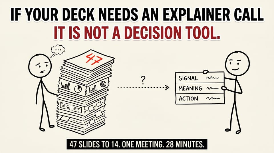
Table of contents
He sent the deck at 9pm and asked if I had 15 minutes the next morning to "walk leadership through it."
47 slides. Three research phases. Two consultants. One exec audience.
I opened it. By slide 8 I was screenshotting findings into Apple Notes to keep them straight.
That is the tell.
If you cannot read a research deck without the person who built it sitting next to you, it is not a decision tool. It is a data dump someone is asking the room to assemble in real time.
This piece is about what changed when the team caught it, rebuilt the deck before the meeting, and walked into the room with a different question. Same data, different shape. Two of three decisions closed in 28 minutes. The third escalated cleanly with a one-page brief. Below is the structure that did the work, the cuts that made it possible, and the three checks you can run on any research deck before it goes up.
The 47-slide version, in plain shape
The brief sounded simple. "Pull together highlights from three phases of research into one deck for leadership." Three phases meant three completely different data types: semiotics, online discussion boards, and concept testing. Three owners. Three slide vocabularies. One executive audience who had not lived inside any of it.
The shortest path was the wrong one. Paste in screenshots from each workstream, label them, hand it off. That was the 47-slide version. Looks comprehensive. Reads as opaque.
Here is what that deck looked like, in shape, before the rebuild:
- Slide 1: Cover.
- Slide 2: Agenda.
- Slide 3: Methodology overview.
- Slides 4 to 16: Semiotics findings, screenshots and annotations.
- Slides 17 to 28: Online discussion board findings, screenshots and pull quotes.
- Slides 29 to 41: Concept testing results, charts and confidence intervals.
- Slides 42 to 45: Cross-cutting themes.
- Slide 46: Recommendations.
- Slide 47: Appendix marker.
The cross-cutting themes slide was where the synthesis was supposed to happen. By the time the audience got to slide 42, they had already lost the thread. The synthesis slide was four bullets long. Each bullet referenced findings on prior slides by slide number. To follow it, the audience had to scroll back.
That is the moment most readers give up and ask for an "explainer call."
The rebuild question
The team backed up and asked a different question. Not "what did we learn?" That had already been answered three times by three different methods. The right question was "what should leadership decide in the next 30 minutes, and what does our data tell them they can or cannot do?"
Once that was the question, the structure rebuilt itself.
Three decisions were on the table. The deck had to surface each one with enough context for the room to greenlight, deprioritize, or reframe. Everything else was support.
The rebuilt deck came in at 14 slides plus a 23-page appendix. The meeting ran 28 minutes. Two of the three decisions got made in the room. The third got escalated cleanly. That was a good outcome. Escalating without the deck would have been chaos. Escalating with the deck took a paragraph.
The signal-meaning-action structure
Every decision-supporting slide in the rebuilt deck answered three things in order:
- Signal: what we saw in the data. One sentence. No methodology in the line. No method-specific jargon ("on a 7-point Likert," "valence analysis surfaced") unless the audience already speaks that language.
- Meaning: what that tells us about the customer, market, or product. One sentence. Plain operator language. The interpretation, not the description.
- Action: what choice or tradeoff is now in front of leadership because of it. One sentence with an implied verb. "Greenlight X." "Deprioritize Y." "Trade off A against B and decide which."
Three lines on the slide. Then a single supporting visual underneath: a chart, a pull quote, a sketch. One visual per slide. Not three.
The visual is not the proof. The three lines are the deck. The visual is the evidence the audience can scan in two seconds to confirm the conclusion is grounded.
This is the move that turns a research summary into a decision tool. You can run any research deck through this structure. If a slide does not have a signal, a meaning, and an action that fit on one page in three sentences, it is not a decision slide. It belongs in the appendix or it belongs in a different deck.
Appendix discipline
The 47-slide deck did not have an appendix. The rebuilt deck had an appendix that ran to 23 pages and contained almost all of the original 47.
That is not a contradiction. It is the discipline.
The appendix is where you put: methodology details, sample sizes, confidence intervals, full quote sets, every chart that was not the supporting chart on the decision slide, the cross-tabs that one specific exec will ask for, the raw screenshots from the discussion boards. Anything that earns credibility but does not move the decision. All of it.
The appendix is sacred. It signals respect for the work, respect for the audience who wants depth, and respect for the room's time on the front end. Most teams underweight it because nobody screenshots an appendix slide. That is fine. The point of the appendix is not to be screenshotted. The point is to make the front-of-deck synthesis defensible without being expansive.
A few rules I have used and seen work:
- The appendix gets a single index page at the front. Section headers link to sections.
- The appendix is allowed to break formatting rules the front-of-deck enforces. Charts can be dense. Quotes can run long. The audience that goes to the appendix wants the density.
- The appendix is never paginated into the main deck flow. It is its own document, attached or linked, never sitting between two decision slides.
- The appendix is not where you put your "comprehensive findings overview." That belongs in a separate document if it needs to exist at all. The appendix is reference material, not a parallel narrative.
When the appendix discipline holds, the front-of-deck gets to be as tight as the decision actually demands. When the appendix discipline breaks, the front-of-deck bloats to defend itself, and you get the 47-slide version again.
Three questions before you build any research deck
When I am asked to look at a deck before it goes up, I run three questions in order. They take about ten minutes to answer and almost always change what the deck should be.
What are the two or three decisions this audience is actually being asked to make? Not the topic they are interested in. The choices they have to greenlight, deprioritize, or reframe. If you cannot name them, you do not have a decision deck. You have a research readout. Those are different artifacts with different audiences.
For each decision, what does the data say the constraints are? Not "what did we learn." What can the audience not do because of what we saw. What does the data unblock. Constraint-and-unblock framing is decision language. "What we learned" framing is summary language.
What is the one slide they will screenshot and send to someone else after the meeting? That slide should be the thesis of the whole deck, not a methodology page. If you cannot point at it, your deck does not have a thesis slide yet. Build it first, then build the rest of the deck around defending it.
If you cannot answer all three in ten minutes, the deck is not ready to go up.
What to take out
The slides that almost always get cut in the rebuild, in order of how reliably they disappear:
The agenda slide. Read the room. The audience knows why they are there. An agenda slide is a tax you pay before you start.
The methodology slide as slide 2. Methodology earns credibility, but it earns it after the audience trusts the conclusion. Put it later or put it in the appendix. The exception is when the audience is methodologically skeptical of the approach itself. In that case, the methodology gets a slide, but it goes after the thesis, not before.
Quote walls. One operator quote per finding is signal. Five operator quotes per finding is noise that asks the audience to do the synthesis. If five quotes are needed, the synthesis is not done yet.
The "everything we learned" map. It comforts the team. It crushes the audience. The team built the map because the work was sprawling. The audience does not need a map of the work. They need the conclusion.
The next-steps slide that lists 14 next steps. If everything is a next step, nothing is. Two or three actions, attached to the decisions on the table, owned by named humans, with a date.
What stays in
What stays in is much shorter and bears repeating because most teams reach for "more" when in doubt and the right move is "less."
A one-line thesis on slide 1. Sometimes embedded in the cover slide. The thesis is what the audience should walk out believing.
A "what changed in our understanding" slide near the front. Two to three sentences. This is the diff between what the room thought before the research and what we now have evidence to support or refute. This slide is often the screenshot slide.
Three to five decision slides, each in signal-meaning-action structure.
A clean recommendations slide that maps recommendations to decisions, not to findings.
A one-page appendix index for anyone who wants to go deeper.
Twelve to 16 slides usually does it. If it does not, the question to ask is not "what else should we add?" It is "what is the decision this audience cannot make with what we have, and is that a deck problem or a research problem?"
Those two problems solve very differently. Conflating them is what produces the 47-slide deck.
The harder thing
The harder thing is that a decision-shaped deck makes the team feel exposed.
The 47-slide version protects the team. It says "we did a lot of work." A 14-slide version says "we are confident enough in what we found to recommend a path." That is harder to write and harder to defend if the room pushes back.
That is also the work. The reason the room hired you, or pays you, or routed the research through your team in the first place, is for the synthesis. Not the synthesis-and-here-is-all-the-evidence-just-in-case. The synthesis with the receipts behind it.
The receipts go in the appendix. The synthesis goes up front.
Once you have done this a few times, you start to feel the difference between a research-summary instinct and a decision-deck instinct. The summary instinct says "include it so they have it." The decision instinct says "cut it unless the decision dies without it." Most research culture trains the summary instinct. The work is unlearning it.
There is an adjacent pattern worth naming here. B2B service firms tend to over-produce in defense of their methodology because methodology is the hardest thing to differentiate on. I wrote about a related shape last week in a piece about how most B2B service firm websites are doing zero work for pipeline. The deck problem is a version of the website problem, scaled down to one meeting. Both are about confusing "showing the work" with "doing the work." Both get fixed by asking what the audience is being asked to do.
A walkthrough you can run on your next deck
This is the version of the three-question check I run on my own decks before they go up. It takes ten to fifteen minutes if the deck is in reasonable shape.
Read the deck without scrolling, top to bottom, at a normal pace. Time yourself. If you cannot land the thesis in five minutes, the audience will not either.
Cover the visuals. Read only the slide titles and the on-slide text. Does the thread of the argument still hold? If the argument relies on the visuals to carry meaning, the visuals are doing the synthesis work the text should be doing.
Open a blank doc and write what the deck told you. Two to three sentences. If you can do that, the deck has a thesis. If you produce a list of bullets that recap the workstreams, the deck is still a summary.
Ask one person on the team to flip to the appendix and confirm three pieces of evidence on demand. Methodology depth, sample size, the cross-tab that supports the thesis. If the appendix can produce all three in under 60 seconds each, it is doing its job. If not, the appendix needs an index.
Pick the slide you would screenshot. If you would not screenshot any of them, build the thesis slide. If you would screenshot three of them, you have buried your thesis behind two competitors. Promote one and demote the others.
Most decks pass two of those five on the first run. The fifth one is the hardest. The fifth is what separates a research summary from a decision tool.
Why this matters in 2026
The pressure on insights teams is going one direction. Faster cycles. More data sources. AI summaries that produce a 40-slide "highlights" deck in 90 seconds with no human curation. The 47-slide trap is going to get worse before it gets better.
The competitive moat for an insights team in 2026 is not "we can produce more findings faster." A machine can do that. The moat is "we can produce decisions out of findings, and we can defend the recommendation."
That is a synthesis muscle. It is built by repetition under pressure. It looks like cutting more than the team is comfortable cutting, on every project, until the cut is reflexive. It looks like signal-meaning-action on every decision slide. It looks like an appendix that is sacred.
If you are running an insights function or buying research from one, that is what to ask for. Not "produce a comprehensive readout." Produce a decision deck. With the appendix to back it up. Hold the team to that standard and the work changes.
What you can do today
Pull up the last research deck you delivered or sat through.
Run the three checks: thesis-in-five-minutes, every-section-closes-with-an-action, one-slide-they-would-screenshot. Honest answers.
If the deck fails one of the three, you have a path. Cut a third of the slides. Put the cut slides in an appendix. Rewrite the front-of-deck in signal-meaning-action structure.
If the deck fails two of the three, the issue is upstream of the deck. The research did not land on a thesis yet. That is not a deck problem. Send it back to synthesis before you send it up.
If the deck fails all three, the question is whether the audience is the right audience for this deck. Sometimes the answer is "no, this is a workstream readout that got promoted to a leadership deck without a rewrite." That is a process problem, not a synthesis problem.
If the deck passes all three, send it. The 28-minute meeting and the closed decisions are on the other side.
Want help on this?
This is the shape of work Chykalophia does for B2B service firms that are sitting on more research than they can synthesize, or whose internal decks are not producing decisions in the rooms where they should be. If your insights function is running well but the readouts feel slower than they should be, that is usually a deck-design and audience-question problem, not a research problem. Worth running through the three checks first.
If you want a second pair of eyes on a specific deck before it goes up, you can reach out via the contact page on Chykalophia. I do this kind of review for a small number of teams each quarter. Quiet. No pitch deck. Just the three checks, then a 30-minute call.
For more on how this same "showing the work versus doing the work" pattern shows up in B2B service firm websites, the piece I wrote on the marketing-versus-pipeline gap lays out the math at $5M to $20M revenue. The deck problem and the website problem are the same problem in different surface area.
What is the last research deck you sat through that closed a decision instead of opening more questions?