5 Easy Fixes to Those Annoying Push Notifications
Originally written by Nadya Ong for Chykalophia.
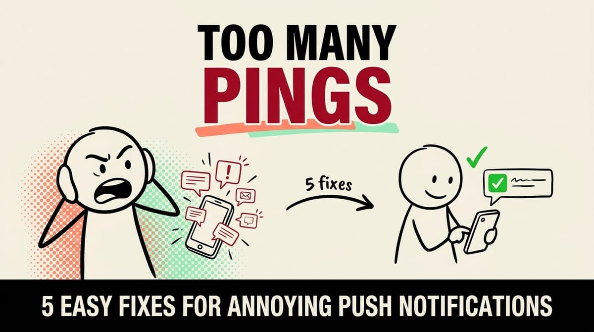
Annoying push notifications are one of the most common causes of user disengagement. This article walks through the push notification mistakes you need to avoid, along with the tips that actually encourage users to click.
Have you ever felt frustrated by the sea of push notifications that flood your phone all day long, every single day? Well, you’re not alone. It turns out that more than half of app users find push notifications annoying!
While you might relate to the feeling of irritation, it can also be a hard pill to swallow when you are a user and a business owner. Push notification is a great marketing channel for your brand, yet they can also be so annoying that people (including you, perhaps) disable them from their smartphone and tablet.
What creates this love-hate relationship between users and push notifications? What are the most common push notifications mistakes and how can you fix them? Let’s find out here!
Push Notifications Mistakes that Make Users Disable Them
Research from VWO Engage shows the top reasons why users decide to unsubscribe or disable the push notifications from a certain app.
Why users turn push notifications off
- Find them annoying: 53%
- Distracted during daily use: 49%
- Disturbed at the wrong time: 38%
Top reasons users give for muting or unsubscribing from an app's push notifications, in a VWO Engage survey. Source: VWO Engage survey, via Business of Apps.
Other than these three reasons, users also dislike push notifications for reasons like:
- They’re spamming
- Generic, non-personalized content
- Irrelevant content with zero value
- Clickbait
- Outdated content or offer
- Flashing colors and sound
Every notification you send spends a little of the user's trust. Most apps overspend.
How to Avoid Sending Annoying Push Notifications to Your Users
Now that you know why users find push notifications annoying, here’s what you can do to avoid making the same mistakes on your app.
1. Provide In-App Control & Permissions
Your app users should have control over what push notifications they want to receive. You can also add a gentle disclaimer like, “Please turn on only your most preferred notifications as we don’t want to bother you.”
- Build a preference center with one toggle per notification category and default the non-essential ones off.
- Prime the ask: show a soft in-app explainer first, so the OS permission dialog only fires after the user picks a category.
- Map each toggle to a Braze Subscription Group, or store the choices as OneSignal tags and target on them at send time.
- Add a one-line reassurance that they can change this anytime in Settings.
See a worked example
As an example, a meditation app could replace its single OS permission prompt with an in-app screen that lets a new user toggle 'daily reminder', 'streak alerts', and 'new content' separately, then only fire the system prompt once they have opted into at least one. In practice that tends to leave fewer people stuck at a blunt allow-or-deny choice.
Tools to use
Apple HIG: Managing notifications for grouping and control guidance, and Braze's drag-and-drop preference center to let users pick categories instead of all-or-nothing.
Steal our AI prompt
Here is my app and its current notification opt-in flow: [describe app and when you currently ask for push permission]. Here are the notification types I send: [paste list]. Draft a notification preference center: group these into 3-5 user-friendly categories, mark which should default on versus off, write the microcopy for each toggle and for a soft pre-permission priming screen shown before the OS prompt, and flag which categories are transactional and should never be capped or turned off.2. Choose the Appropriate Time Frame
This is to minimize the disruption you cause in your users’ daily life. Here’s an easy way to choose a time frame, depending on your app type or business sector:
| Time Frame | App Type |
|---|---|
| Morning | News, educational information |
| Daytime | Work-related notifications |
| Late Afternoon | More news from the day |
| Evening | Entertainment & e-commerce |
- Switch non-urgent campaigns from a fixed clock time to per-user send-time optimization (Braze Intelligent Timing or OneSignal Intelligent Delivery).
- Set a sensible fallback time for users with no engagement history, and keep genuinely time-sensitive alerts like OTP and delivery on immediate send.
- Respect each recipient's local time zone so nothing lands at 3am.
- Use the day-part map above as a starting hypothesis, then let the data correct it.
See a worked example
As an illustration, an e-commerce app that blasts every subscriber at 9am could instead let a send-time engine deliver each person's 'back in stock' alert near the hour they usually open the app, so a commuter who browses at 8pm gets it then rather than mid-morning when it gets buried under everything else.
Tools to use
Braze: Intelligent Timing and OneSignal: Intelligent Delivery both send each user at their most-engaged hour instead of one fixed time.
Steal our AI prompt
My app is [describe app and sector] and I send these campaign types: [paste list with current send times]. For each one, tell me whether it should use per-user send-time optimization, a fixed local-time send, or immediate delivery, and explain why. Then suggest a starting day-part (morning, midday, afternoon, or evening) per campaign and a fallback send time for users who have no engagement history yet.3. The Fewer, the Better
There’s no one-size-fits-all number, but 73% of users think that if an app sends too many push notifications, they are considered spam.
That said, it’s better to focus on the quality of the message, not quantity.
- Measure how many pushes a single user actually receives per day and week across all campaigns and teams before you pick a number.
- Set a conservative frequency cap in Braze or OneSignal and exempt transactional messages from it.
- Decide which message wins when several compete for the same slot.
- Watch opt-out and open rates as you tune the cap instead of guessing.
See a worked example
As an example, a news app that currently pushes 10 alerts a day could set a cap of, say, 2 to 3 non-urgent pushes per user per day, with the ones that miss the cap held or dropped. That tends to protect the few that really matter, like genuine breaking news, from being tuned out along with the rest.
Tools to use
Braze: Rate limiting and frequency capping and OneSignal: Push frequency capping both cap messages per user over a rolling window and exempt transactional sends.
Steal our AI prompt
Here are all the push campaigns and automated triggers that can reach a single user: [paste list with cadence]. Estimate the worst-case number of notifications one user could receive in a single day, flag the biggest over-messaging risks, recommend a starting frequency cap (one figure per day and one per week), and list which message types should be exempt from the cap because they are transactional.4. Use Non-Intrusive Colors & Sounds
Bright, striking colors and loud, shrill sounds can cause stress and distract users more greatly. We recommend you choose neutral colors for your push notification icons or designs. Also, provide options to change or turn off the sounds.
- Follow the platform notification anatomy (Apple HIG and Android) rather than inventing your own loud styling.
- Use a calm, on-brand accent color and avoid bright red or flashing unless the message is truly urgent.
- Let the OS default sound do the work, give users a way to silence it, and on Android split noisy versus quiet messages into separate notification channels.
- Reserve high-importance heads-up treatment for genuinely time-critical notifications.
See a worked example
As an example, a finance app could swap a red flashing icon and a loud alert tone for a muted brand accent color and the default gentle sound, reserving the louder treatment only for genuine security alerts. That keeps a routine 'statement ready' ping from feeling like an emergency.
Tools to use
Apple HIG: Notifications for content and restraint principles, and the Android Notifications design guide for importance levels and channels.
Steal our AI prompt
Here are the push notification types my app sends and their current visual and sound treatment: [describe icons, colors, sounds, and which use a heads-up or high-importance style]. Recommend a restrained default treatment (icon color and sound) per type, tell me which types genuinely warrant an urgent heads-up style and which should be quiet, and for Android suggest how to split them into notification channels that users can control.5. Make Them Fun & Personal
Push notifications with generic and irrelevant content turn users off. And in turn, they drive users to turn them off. Try these to send more engaging push notifications:
- Utilize liquid tags. You can use this to mention your user’s name, products added to the cart, send unique voucher codes, and many more.
- Send dynamic, behavioral push notifications. These can range from new user offers and abandoned cart reminders, to suggested videos or podcasts.
- Don’t be afraid to use emojis. Just don’t get too crazy and use them in moderation. Also, make sure the use of emojis reflects your brand's tone of voice and perception.
- Personalize with real profile and behavior data using Liquid (first name, cart item, last-viewed category), always with a default fallback so an empty field never breaks the sentence.
- Trigger from behavior like an abandoned cart, a new-user offer, or content they follow, instead of one blast to everyone.
- Use emoji sparingly and on-brand, and preview on-device since rendering varies.
- A/B test personalized against generic copy before rolling it out widely.
See a worked example
As an example, instead of 'Your items are waiting', a personalized abandoned-cart push could read 'Aisha, your running shoes are still in your cart' with one small emoji. Tying the copy to the real product and first name tends to read as helpful rather than generic spam.
Tools to use
Braze: Use Liquid and OneSignal: Using Liquid syntax both insert names, cart items, and attributes into copy with fallback defaults.
Steal our AI prompt
Here are 5 generic push notifications I currently send: [paste them]. Rewrite each to be personalized and behavior-triggered: use Liquid placeholders for first name, product, or category with sensible default fallbacks, note which trigger event should fire it, add one tasteful on-brand emoji only where it fits, and keep each under the platform's visible character limit. Flag any that should stay plain text.Ready to Bid Those Annoying Push Notifications Goodbye?
Even though half of the app users find push notifications annoying, the other half don’t mind them and even find them useful.
So, make sure you give your users the quality information they need so they don’t regret checking their phone when your push notification pops in. Getting that balance right is a UX discipline, and it is what our UX and web design work is built around.
Want push notifications your users actually welcome?
We help brands design messaging and UX that engages instead of annoys. Let's make yours something people look forward to.
Get the next one by email
One practical fix every two weeks for owners of established B2B companies. Websites, conversions and operations, written plainly.

Peter Krzyzek
eter Krzyzek is co-founder and CTO of Chykalophia, the Chicago agency that builds strategy-led websites for established B2B companies, and co-author of Made to Sell.
Comments